
CSS PLAY
Doing It With Style

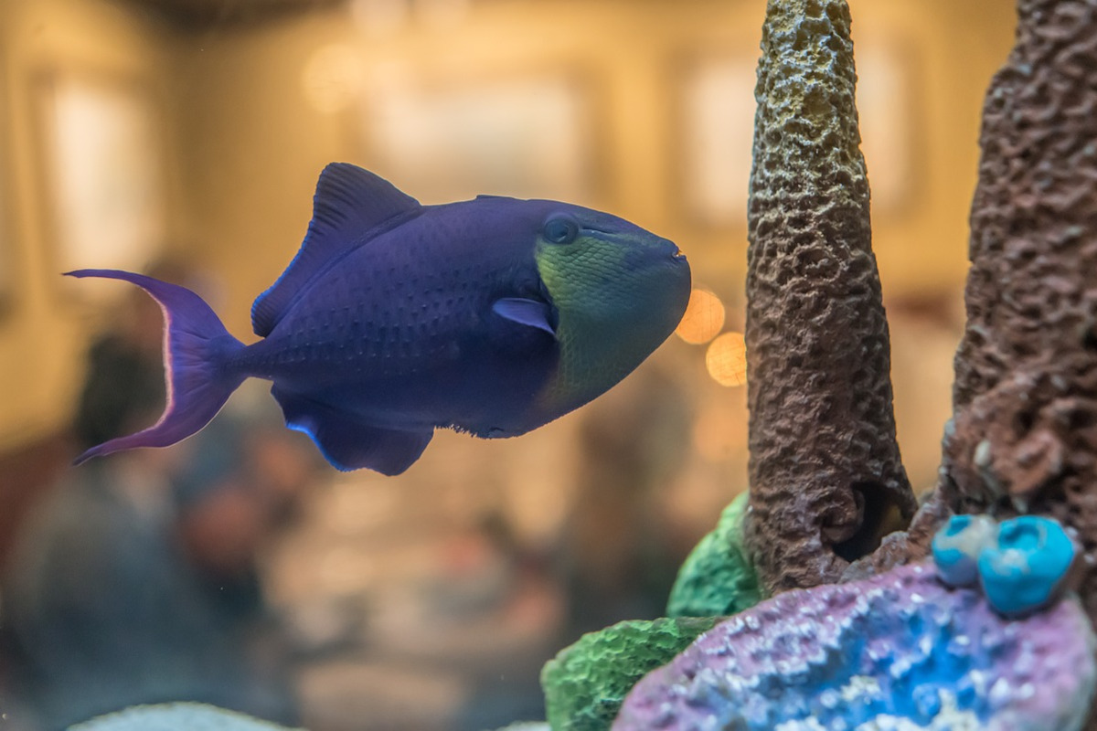


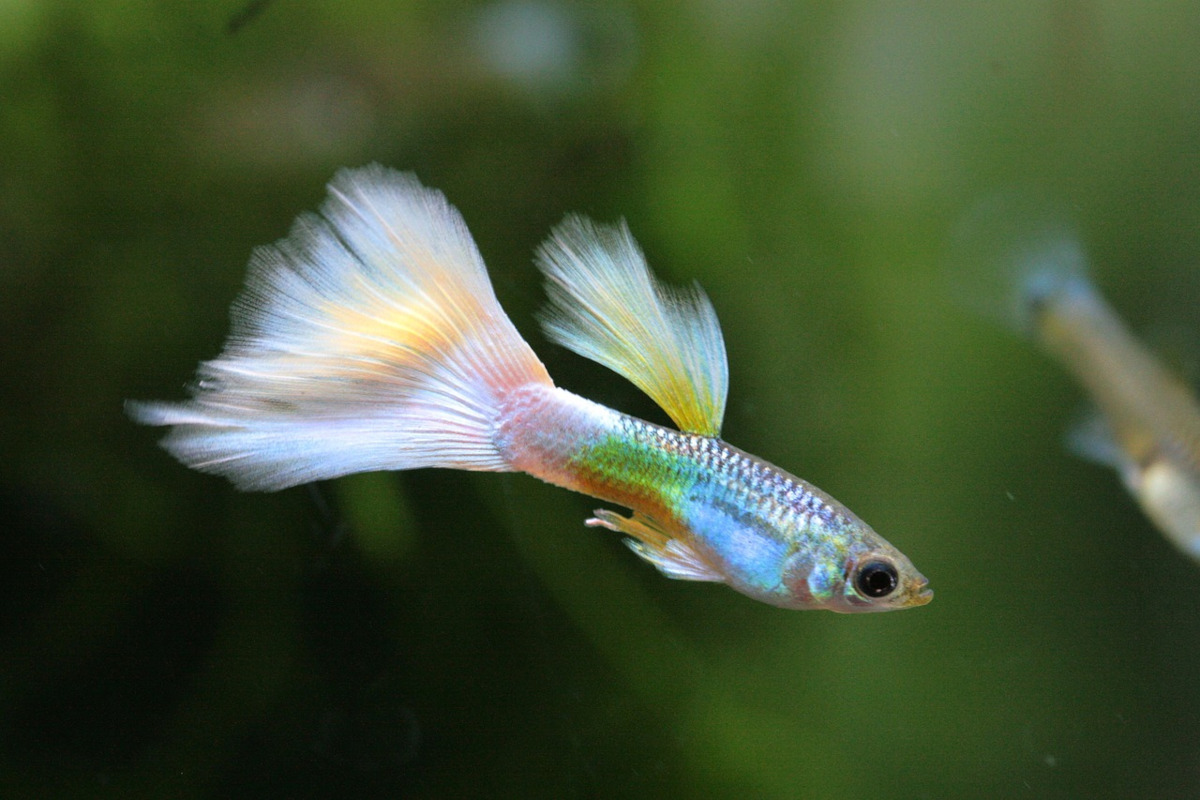
This is the first in the 'HOW TO' series of demonstration giving more information and methods of producing HTML/CSS carousel slideshows.
The above demonstration is about as simple as it gets to produce a responsive, auto running carousel/slideshow using minimal HTML and CSS.
The HTML is just three nested divs with a set of nested images
<div id="outer">
<div id="slide">
<div id="show">
<img src="fish2/fish1.jpg" title="" alt="">
<img src="fish2/fish2.jpg" title="" alt="">
<img src="fish2/fish3.jpg" title="" alt="">
<img src="fish2/fish4.jpg" title="" alt="">
<img src="fish2/fish5.jpg" title="" alt="">
<img src="fish2/fish6.jpg" title="" alt="">
<img src="fish2/fish7.jpg" title="" alt="">
<!-- repeat the first image at the end -->
<img src="fish2/fish1.jpg" title="" alt="">
</div>
</div>
</div>
Repeat the first image code at the end of the image list.
NOTE: For this demo you can have as many images as you like. The CSS takes care of the variables.
The CSS is just a set of 'variables' to control the number of images and the slide times.
The first step in the CSS is to set up the carousel variables.
:root {
--images: 7; /* number of images */
--aspect: 3/2; /* aspect ration of images */
--gap: 20px; /* gap between slides */
--gapcolor: #000; /* color of the --gap if set */
--slidetime: 5s; /* static time plus slide time */
/* do not change these calculations */
--margin: calc(-100% - var(--gap));
--left: calc(var(--margin) * var(--images));
--totaltime: calc(var(--slidetime) * var(--images));
}
The --margin variable calculates the width of the image and the gap.
The --left variable calculates the total width of all the images and gaps.
The --totaltime variable calculates the total time to show all the images.
The id="outer" div is styled as follows:
#outer {width:90%; max-width:720px; margin:30px auto; aspect-ratio:var(--aspect); overflow:hidden;}
This set up the maximum and minimum width for small screens to make the carousel responsive and centred. The top and bottom margins are optional.
The id="slide" div is styled as follows:
#slide {width:100%; height:100%; background:var(--gapcolor);}
This sets the slide size to the image size and the background --gap color.
The images are styles as follows:
#show img {display:block; margin:0; height:100%; padding-right:var(--gap);}
This sets the images height to the #outer height which keeps the aspect ratio correct.
Finally the id="show" div, which does all the work is styled as follows:
#show {display:flex; flex-wrap:nowrap; height:100%; animation: slide var(--slidetime) infinite, shift var(--totaltime) steps(var(--images)) infinite; position:relative;}
This sets the display:flex with no wrap to keep the images inline.
This also sets up the two animations which will work with any number of images.
The first animaton is 'slide var(--slidetime) infinite'
@keyframes slide {
0% {margin-left:0;}
80% {margin-left:0;}
100% {margin-left:var(--margin);}
}
This keeps the image still for 0% to 80% and slides margin-left, one image, for 80% to 100%. So in this case the total period is 5 seconds with 80% still and 20% moving.
The second animation is 'shift var(--totaltime) steps(var(--images)) infinite'
@keyframes shift {
0% {left:0;}
100% {left: var(--left);}
}
This moved all the images left 100%. But, as the steps are set to the number of images, this jumps to the next image after '--slidetime' 5 seconds.
So the 'slide' animation slides the 'id=show' left and the 'shift' animation jumps the 'id=show' left by the image + gap width for each image and gap.
SIMPLE :)