
CSS PLAY
Doing It With Style

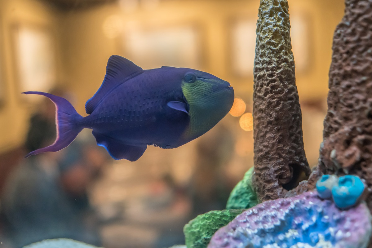


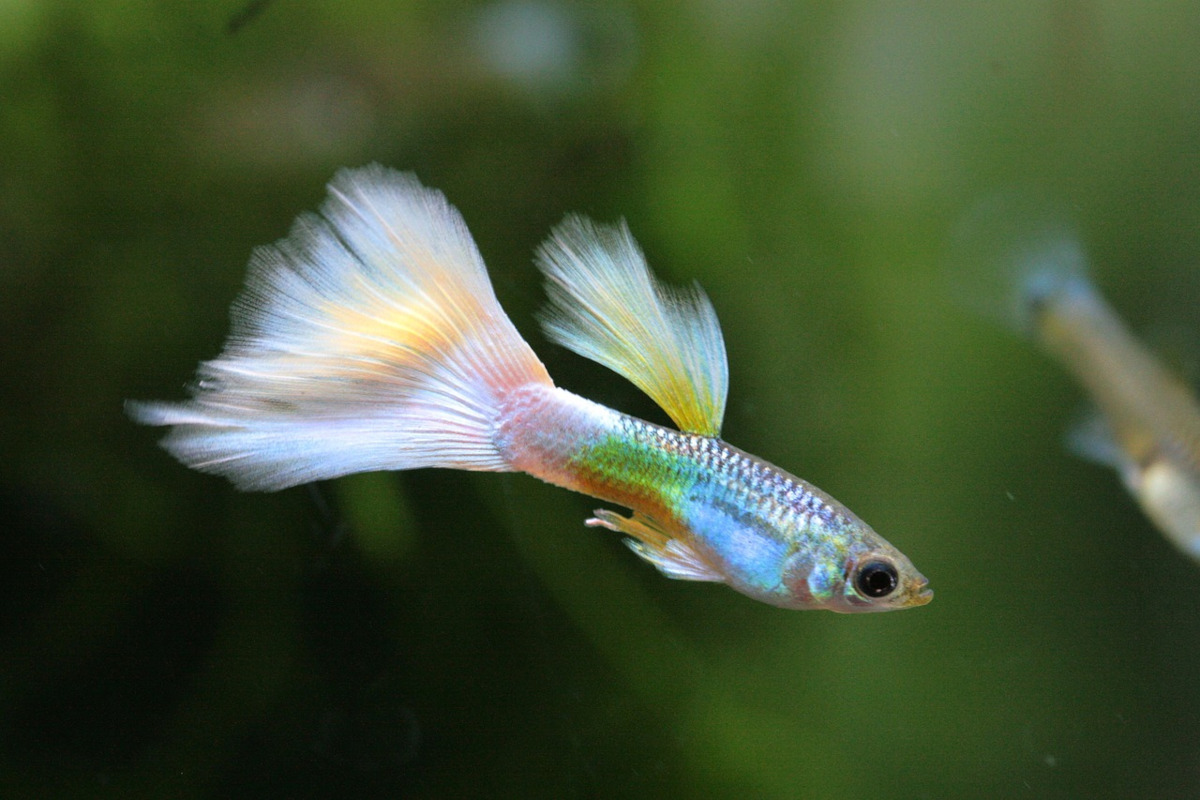
This is #4 in the 'HOW TO' series of demonstration giving more information and methods of producing HTML/CSS carousel slideshows.
We are now getting a little more complex in the CSS, using @keyframes to count and allow us to know the current image number.
So the slideshow starts in auto run mode. Click any button to switch to manual mode where you can select any image.
In manual mode you will see a play icon at the top left of the slideshow. Click this to switch back to auto run mode which will continue from the image that was on screen when switched to manual mode.
The HTML is still very simple, as follows.
<div id="outer">
<label for="p0"></label>
<input type="radio" id="p0" name="control" checked>
<div id="slide">
<div id="show">
<img src="fish2/fish1.jpg" title="" alt="">
<img src="fish2/fish2.jpg" title="" alt="">
<img src="fish2/fish3.jpg" title="" alt="">
<img src="fish2/fish4.jpg" title="" alt="">
<img src="fish2/fish5.jpg" title="" alt="">
<img src="fish2/fish6.jpg" title="" alt="">
<img src="fish2/fish7.jpg" title="" alt="">
<img src="fish2/fish1.jpg" title="" alt="">
</div>
</div>
<div id="buttons">
<label for="p1"><input type="radio" id="p1" name="control"></label>
<label for="p2"><input type="radio" id="p2" name="control"></label>
<label for="p3"><input type="radio" id="p3" name="control"></label>
<label for="p4"><input type="radio" id="p4" name="control"></label>
<label for="p5"><input type="radio" id="p5" name="control"></label>
<label for="p6"><input type="radio" id="p6" name="control"></label>
<label for="p7"><input type="radio" id="p7" name="control"></label>
<span></span>
</div>
</div>
Repeat the first image code at the end of the image list.
NOTE: For this demo you can have as many images as you like. The CSS takes care of the variables.
The stylesheet is as follows.
 :root {
--images: 7; /* Number of images */
--aspect: 3/2; /* Aspect ration of images */
--gap: 20px; /* Gap between slides */
--gapcolor: #fff; /* Color of the --gap if set */
--slidetime: 5s; /* Static time plus slide time */

/* Do not change these calculations */
--margin: calc((100% + var(--gap)) * -1);
--left: calc(var(--margin) * var(--images));
--totaltime: calc(var(--slidetime) * var(--images));
--count:0;
}

Set the width for small screens (90%) and the maximun width for large screens.

#outer {width:90%; max-width:720px; margin:30px auto; aspect-ratio:var(--aspect); overflow-x: clip; animation:shift var(--totaltime) infinite; box-shadow: 0 0 0 2px black; position:relative;}

#slide {width:100%; height:100%; background:var(--gapcolor);}

#show has the two @keyframes animations and need no alterations for any number of images.

#show {display:flex;  flex-wrap:nowrap; height:100%; width:100%;  animation: slide var(--slidetime) infinite; position:relative; left:calc(var(--count) * (-100% - var(--gap)));}

The image padding-right uses the css variable --gap to space out the images.

#show img {display:block; margin:0; height:100%; padding-right:var(--gap); transition:1s;}

This is the stationary plus the slide timing. Adjust the 80% value to change the slide time

@keyframes slide {
0% {margin-left:0;}
80% {margin-left:0;}
100% {margin-left:var(--margin);}
}

This is the 'shift' animation that stores the number of the current image in a css variable. This is used to calculate the left position of the #show div.
The only downside is that you need to calculate the % values depending on the number of images.


@keyframes shift {
0% {--count:0;}

14.285% {--count: 0;}
14.286% {--count: 1;}

28.571% {--count: 1;}
28.572% {--count: 2;}

42.857% {--count: 2;}
42.858% {--count: 3;}

57.143% {--count: 3;}
57.144% {--count: 4;}

71.429% {--count: 4;}
71.43% {--count: 5;}

85.715% {--count: 5;}
85.716% {--count: 6;}

100% {--count: 6;}
}

When #p0 is checked set all the animations to running and the 'play' icon to display:none

#outer:has(#p0:checked),
#outer:has(#p0:checked) #show,
#outer:has(#p0:checked) #buttons span,
#outer:has(#p0:checked) #buttons::before {animation-play-state:running;}
#outer:has(#p0:checked) label[for="p0"] {display:none;}

When #p0 is not checked set all the animations to paused and the 'play' icon to display:block

#outer:not(:has(#p0:checked)),
#outer:not(:has(#p0:checked)) #show,
#outer:not(:has(#p0:checked)) #buttons::before {animation-play-state:paused;}
#outer:not(:has(#p0:checked)) #buttons span {animation-play-state:paused; z-index:-100;}
#outer:not(:has(#p0:checked)) label[for="p0"] {display:block; cursor:pointer;}

when #p1 to #p7 is checked move the first image left using margin-left with the amount calculated from the css variable --count value minus the image number times the slide width

#outer:has(#p1:checked) #show img:first-child {margin-left:calc(var(--count) * (100% + var(--gap)));}
#outer:has(#p2:checked) #show img:first-child {margin-left:calc((var(--count) - 1) * (100% + var(--gap)));}
#outer:has(#p3:checked) #show img:first-child {margin-left:calc((var(--count) - 2) * (100% + var(--gap)));}
#outer:has(#p4:checked) #show img:first-child {margin-left:calc((var(--count) - 3) * (100% + var(--gap)));}
#outer:has(#p5:checked) #show img:first-child {margin-left:calc((var(--count) - 4) * (100% + var(--gap)));}
#outer:has(#p6:checked) #show img:first-child {margin-left:calc((var(--count) - 5) * (100% + var(--gap)));}
#outer:has(#p7:checked) #show img:first-child {margin-left:calc((var(--count) - 6) * (100% + var(--gap)));}

when in manual mode, highlight the button label of the current image.

#outer label:has(:checked) {background:#000;}

move all the radio inputs off screen

#outer input {position:fixed; left:-99999px; top:0;}

Position the buttons under the carousel images and center the labels using display:flex;

#buttons {width:100%; height:10px; position:absolute; bottom:-20px; left:0; display:flex;}

Style the button labels.

#buttons label {display:block; width:calc(100% / var(--images)); height:10px; background:#888; cursor:pointer; border:1px solid #fff; border-width:0 1px; box-sizing:border-box;}
#buttons label:hover {background:#000; transition:0.5s;}

Using a span to give an indication of the current image in the buttons.

#buttons span {display:block; position:absolute; width:calc((100%) / var(--images)); height:10px; background:#000; border:1px solid #fff; border-width:0 1px; box-sizing:border-box; animation:buttons var(--totaltime) steps(var(--images))  infinite;}

@keyframes buttons {
0% {left:0;}
100% {left: 100%;}
}

Style the #p0 label to look like a 'play' icon using border width and color.

#outer label[for="p0"] {position:absolute; display:block; width:0; height:0; border:14px solid #fff; left:17px; top:13px; border-width:12px 0 12px 20px; border-color:#0000 #0000 #0000 #fff; z-index:100;}

Style a 'cover' for the #buttons div to cover the buttons when the slides are sliding. This stops the buttons from being selected during this period.

#buttons::before {display:block; content:""; width:100%; height:10px; background:#0000; position:absolute; left:0; top:0; z-index:-1; animation: hides var(--slidetime) infinite;}

The timing for the 'cover' animation is the same as for @keyframes slide.

@keyframes hides {
0% {z-index:-1;}
79% {z-index:-1;}
80% {z-index:1000;}
100% {z-index:1000;}
}

p.html {font:600 16px/22px arial, sans-serif;}